Pure Puer Series
Designer | Zhe Kang
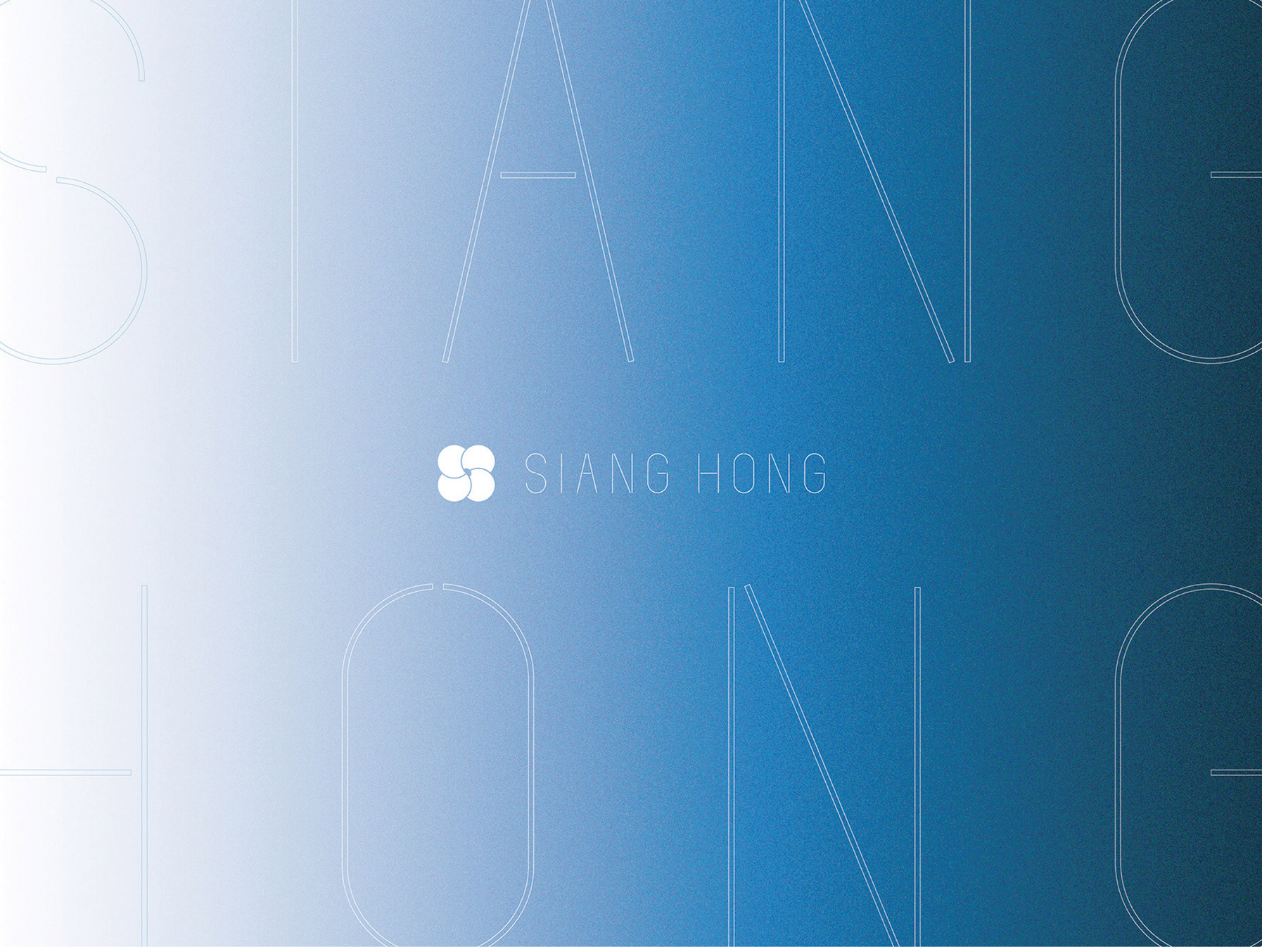
秉持創新、純粹的精神,重新賦予普洱茶新的品牌視覺及意涵,將「茶氣」帶入到包裝,以四種不同漸層去表現溫度的情感與味覺想像,襯托出簡約內斂的美感。
而粗細對比的標準字設計,依然保有普洱茶傳統的優美,以最純粹的樣貌,呈現最原始的普洱。
Embracing innovation and purity, we aim to redefine the brand visual and essence of Pu-erh tea. Incorporating the essence of 'tea aura' into the packaging, we utilize four distinct gradient shades to depict the emotions and flavor sensations associated with varying temperatures, creating a backdrop of simplicity and understated elegance.
The font design, with its contrast of bold and fine strokes, remains faithful to the traditional beauty of Pu-erh tea, presenting it in its purest form. Through our professional expertise and meticulous craftsmanship, we strive to create an unparalleled visual experience that rejuvenates the Pu-erh tea brand, while leading the way in contemporary trends.
/ Pure Puer Packing Design /
由於普洱茶的包裝普遍較為傳統,因此我們嘗試將近年來較流行的極簡設計作為替代,為了讓大眾認識普洱茶的香氣及味覺層次,以視覺來傳遞並賦予它新思維,呈現不同於以往的茶飲美學「普洱,是生活,是時尚,是藝術,也是文化。」
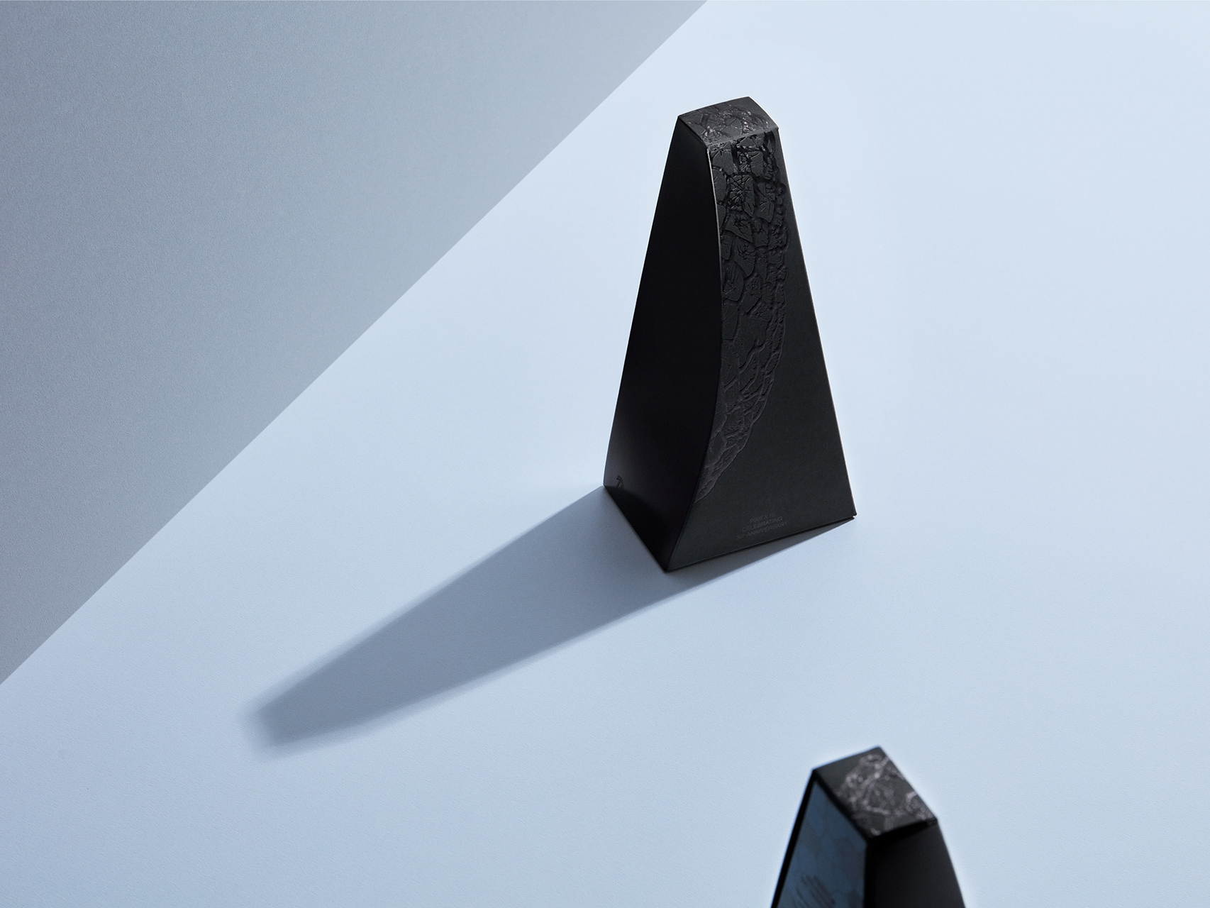
以四種不同漸層去表現溫度的情感與味覺想像,襯托出簡約內斂的美感,而口味及符號的設計以雷雕方式去營造視覺與觸覺上的層次堆疊。
Due to the widespread traditional packaging of Pu-erh tea, we have endeavored to incorporate the increasingly popular minimalist design as an alternative approach. Our intention is to familiarize the public with the aromas and taste profiles of Pu-erh tea, utilizing visual elements to convey and instill fresh perspectives, showcasing a tea aesthetic distinct from the past. "Pu-erh, a way of life, a fashion statement, an art form, and a culture."
Through the use of four distinct gradient shades, we aim to portray the emotions and taste imaginations associated with varying temperatures, accentuating a sense of simplicity and subtle elegance. The design of flavors and symbols employs the technique of bas-relief to create layered visual and tactile experiences.
Studio | Siang Hong Design
Designer | Zhe Kang
School | China University of Technology | Taipei
Photographer | @yaoshi.photo

